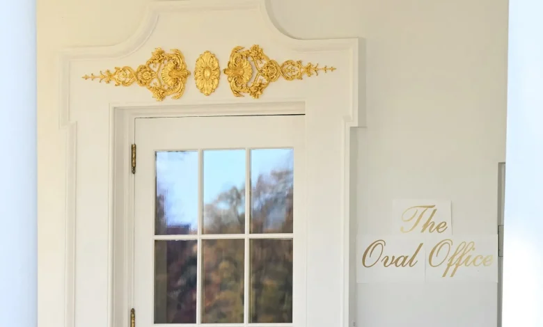
A sign at the White House that sparked backlash and mockery from Democrats and others has been removed. The gold-lettered sign identifying “The Oval Office” that had been affixed outside the office’s door earlier this month is now gone, The Washington Post reported Tuesday.
The sign was printed in a font called “Shelley Script” on what appeared to be white pieces of paper. It became the talk of late-night television and a new target for Democrats during the government shutdown.
Download the SAN app today to stay up-to-date with Unbiased. Straight Facts™.
Point phone camera here
From late-night to social media, critics take aim at ‘Oval Office’ signage
“The government may be closed, but at least Kinko’s is up and running,” Jimmy Fallon remarked on “The Tonight Show” earlier this month.
Other criticism was more harsh, like that of Rep. Malcolm Kenyatta, D-Pa., on social media.
“A: This sign looks like s***,” Kenyatta wrote on Nov. 5. “B: 43 million Americans don’t have access to SNAP and are weeks away from health care costs exploding even more.”
Sen. Lisa Blunt, D-Del., also made her take known online.
“I wish they would focus on helping struggling Americans, but this isn’t a good sign,” she wrote.
California Gov. Gavin Newsom’s office, meanwhile, continued its trolling of President Donald Trump, sharing a doctored photo that replaced “The Oval Office” with “Live, laugh, LOSE.” The message referred to the passage of Proposition 50, which Newsom — a potential Democratic candidate for president in 2028 — said was key to fighting Trump’s efforts to expand GOP seats in Congress.
Will it be back or was it only temporary?
Now the words that captured so much attention are nowhere to be found. The White House has not given any updates on whether they will return or be made permanent.
Straight Arrow News has reached out to the White House seeking more answers on the mystery behind the sign’s disappearance.
A White House spokesperson responded to an inquiry from The Post, but offered a few details. He said the president selected the letter-styling himself and remains “very involved in these beautification projects.”
The spokesperson also called out critics.
“President Trump is making the White House beautiful and giving it the glory it deserves,” the statement to The Post read. “Only people with a severe case of Trump Derangement Syndrome would find a problem with that.”
Other Trump design ventures
Since his return to office in January, Trump has addressed the aesthetics of the White House, including the controversial demolition of the East Wing to make room for his $300 million ballroom project.
He’s also paved over the Rose Garden and poked fun at his predecessor by using an autopen in place of Joe Biden’s portrait in the newly established “Presidential Walk of Fame.”
Design in line with Trump’s preferences
According to The Post, gold letters designating the “Presidential Walk of Fame” were first affixed to an outdoor wall of the White House and used the same font style as the “Oval Office” signage.
A similar font is used at some of Trump’s own properties, including Mar-a-Lago, Trump International Golf Club and the Trump Palace building in New York, according to The Post.
“Trump typography is very consistent with many other things about the president,” Thomas Phinney, a type designer and font expert, told The Post. “Whether you think those things are good or not is another question, but I think it’s part of a consistent package.”
“What Trump is doing is he’s branding his presidency, his occupancy,” Paul Shaw, a graphic designer and historian of typography, told The Post.
Start your day with fact-based news.
Designers give their thoughts
Design professionals also weighed in on the now-removed “Oval Office” sign.
When shown a photo of the temporary letters, Rick Paulus reportedly sighed.
“There’s incredibly little signage of any sort in the White House,” Paulus told The Post. “It’s a house. It’s not a hotel. It’s not a club.”
Traditionally, presidents have left decor decisions to professionals, including Paulus, who made aesthetic choices for the White House during the presidencies of both Bill Clinton and George W. Bush. Neither Clinton nor Bush reportedly gave input on design decisions, although Paulus acknowledged that first lady Laura Bush occasionally provided input.
Paulus also expressed concerns about how much time the president has spent on White House design as opposed to other more pressing issues.
“If he’s spending even 10 hours meeting with people about this stuff, that’s 10 hours he should be dedicating to something else,” Paulus said of Trump.
Phinney likened the lettering to something someone would see “on a restaurant menu,” and Shaw called it “historically too light and weak for signage,” adding that “it’s usually seen on paper, not walls.”
Tim Cramer, a Trump supporter and the owner of a conservative design business that does not work with liberal clients, offered some tempered criticism.
“I’m not crazy about that font,” Cramer told The Post. “It’s high-class. It looks fancy.” But he added that “It’s not utilitarian. It is just the opposite of what it is being used for.”
If Trump had used his services, Cramer said, “I would have made it a plaque, probably something made out of bronze with a utilitarian font that is high contrast against both the background and substrate of the building, so that if you look at it at a distance, you can see it easily.”